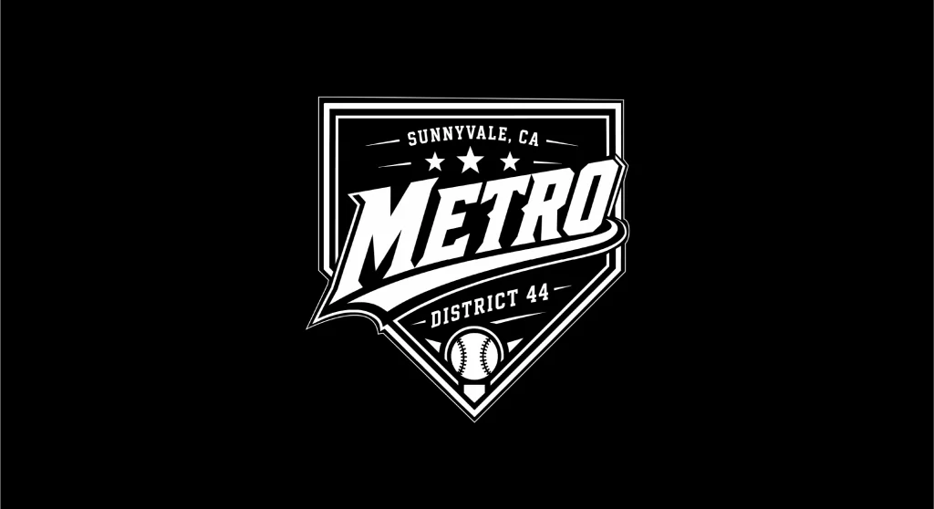
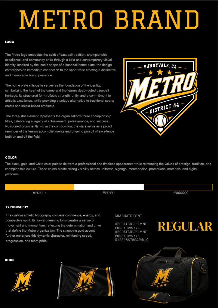
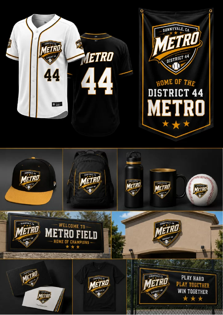
The Metro District 44 logo captures the energy, pride, and competitive spirit of youth baseball through a bold, dynamic identity inspired by classic American sports branding. Its powerful typography and shield-inspired composition create an unmistakable presence, reflecting strength, teamwork, and a tradition of athletic excellence.
The custom athletic letterforms feature strong angles, bold proportions, and subtle perspective, conveying motion, determination, and confidence. The sweeping golden ribbon beneath the primary wordmark reinforces a sense of speed and momentum while visually connecting the different elements into a cohesive badge. Supporting details such as the three stars, baseball icon, and district designation celebrate achievement, community, and the organization’s commitment to developing players both on and off the field.
The black, white, and gold color palette communicates excellence, prestige, and competitive spirit. Black represents strength, discipline, and resilience, while white symbolizes integrity, sportsmanship, and fairness. The vibrant gold accents add energy, victory, and optimism, creating a striking contrast that enhances visibility across uniforms, signage, merchandise, and digital applications.