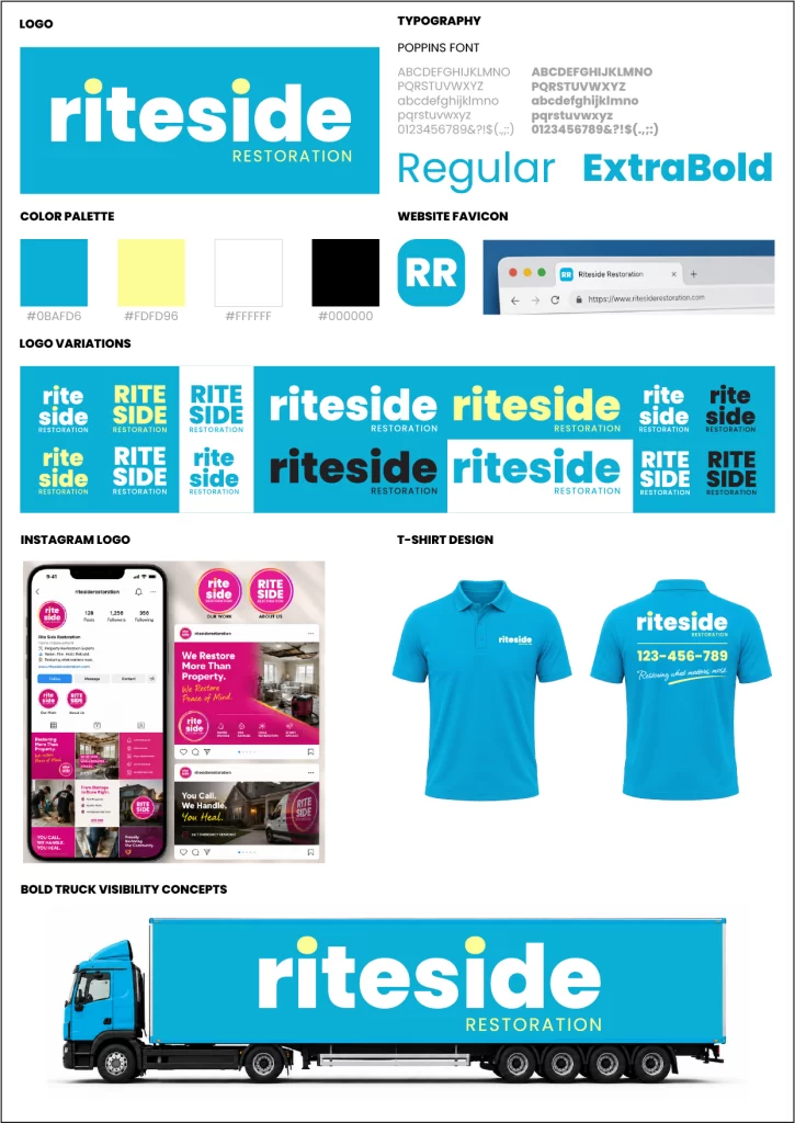
The Riteside Restoration logo reflects professionalism, reliability, and a commitment to restoring properties with precision and care. Its bold, modern wordmark creates a strong visual presence, conveying confidence and dependability while remaining approachable and customer focused.
The clean geometric structure of the typography communicates strength, stability, and efficiency, qualities that are essential in the restoration industry. The custom treatment of the letterforms adds a distinctive character, reinforcing the brand’s dedication to quality workmanship and attention to detail.
The vibrant blue color palette symbolizes trust, integrity, and peace of mind, reflecting the reassurance clients seek during challenging situations involving property damage and recovery. The clear separation between the primary brand name and the supporting descriptor enhances readability while emphasizing the company’s specialized restoration services.
Overall, the Riteside Restoration logo represents a dependable partner dedicated to helping homeowners and businesses recover, rebuild, and restore with confidence. It embodies the brand’s mission to deliver expert restoration solutions with professionalism, responsiveness, and lasting results.